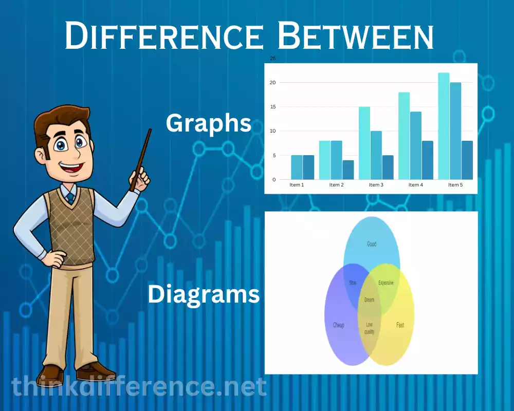
Definition of Graphs and Diagrams
Graphs: Graphs use symbols, like lines, points, and bars, to visually represent relationships among variables or data. They present quantitative information in an organized and understandable format which makes it simpler for readers to comprehend it, compare or correlate trends or correlations and draw meaningful conclusions/make informed decisions – an indispensable asset in many fields such as math, statistics, economics, or science where graphs present data visually in an easy-to-understand format.
Diagrams: Diagrams are visual depictions of relationships, processes, structures, or concepts using symbols, shapes, and lines to visually display information in different forms compared to graphs that mainly present quantitative data. Diagrams can help clarify complicated ideas by visualizing data in an understandable fashion.
Engineers, architects, and biologists utilize diagrams as visual communication devices in fields like engineering, architecture, and biology in order to convey information, present systems and processes visually, examine relationships, and aid problem-solving. Diagrams come in many shapes flowcharts and Venn diagrams are just two forms; there are also mind maps, network diagrams, and organizational charts as visual aids which serve different functions but ultimately aid communication and comprehension.
What are Graphs?
Visual representations of data, and graphs offer visual displays to depict patterns or relationships among variables or data points. Composed of points known as vertices, nodes and edges connected by curves or lines, graphs can serve to display quantitative information in an easy and comprehensible fashion for analysis and interpretation purposes.
Different graphs can be used to present various kinds of information. Some common types of graphs include:
- Line Graphs: Line graphs are useful tools for representing data by connecting points using lines. Such graphs show changes or trends over time easily and visually.

- Bar Graphs: Bar graphs are rectangular bars used to display various categories or variables; their length signifies values or quantities measured, making it easy to comparison between various data categories.

- Pie charts: Pie charts are circular graphs divided into sections representing percentages or proportions of data distribution or composition. Pie charts make an effective visual aid when used for this purpose.

- Scatterplots: Scatterplots are graphs that plot individual data points on two-dimensional charts in two dimensions; with one variable represented horizontally and another vertically. Scatterplots provide an easy way of visualizing relationships or correlations between two variables.

In various fields of mathematics, statistics, and economics – such as mathematics, statistics, and economics – graphs are an effective way of visualizing data easily and making it accessible for interpretation. They help identify patterns, trends, and relationships within data that enable informed decisions and meaningful conclusions to be drawn from it.
What are Diagrams?
Diagrams are visual depictions of relationships, structures, concepts, or processes using symbols, shapes, and lines to represent them visually. Diagrams provide a great way to present information more visually while organizing complex ideas; this makes them an effective alternative to graphs which only display quantitative data whereas diagrams can represent qualitative information, relationships between elements as well as abstract concepts.
Different Diagrams can be used to present various kinds of information. Some common types of diagrams include:
- Flowcharts: Flowcharts are visual displays used to illustrate the flow, steps, and decisions within a system or process. Utilizing various shapes and lines they depict the actions within this framework such as algorithms, workflows, or decision making processes.

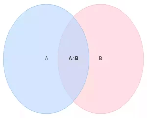
- Venn Diagrams: Venn Diagrams Are A Great Way To Demonstrate Similarities and Differences Venn diagrams are commonly used to illustrate similarities and distinctions among groups or sets of objects by drawing circles that overlap or other shapes that fit. Such diagrams often serve to highlight intersections among ideas or elements within concepts or elements.
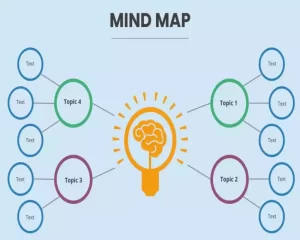
- Mind Maps: Mind Maps are hierarchical charts that outline an idea in its entirety before branching off into related subtopics. Mind maps can help organize thoughts, generate new concepts, and represent relationships among concepts.
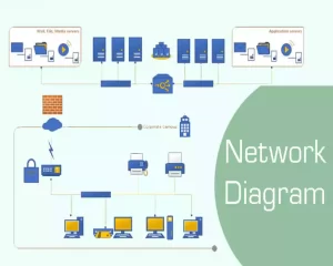
- Network Diagrams: Network diagrams illustrate the relationships and interdependencies among elements or nodes in a network or system, such as computer science or telecom. Such diagrams may also serve to demonstrate dependencies and relationships in these industries.
Diagrams can be utilized in many fields to communicate ideas, solve problems and analyze data effectively – such as engineering, architecture, and biology. Diagrams also serve an educational function and the computer science field as they aid in visualizing information for improved comprehension and decision-making purposes.
Differences Between Graphs and Diagrams
There are distinct differences between graphs and charts; although both may use symbols and visual representation to represent information visually. We present here some key distinctions:
- Purpose: Graphs have many uses, from visualizing quantitative data or patterns between variables to representing qualitative information like relationships or structures within systems or concepts – data analysis and visualization being their main functions. Diagrams on the other hand serve a wider purpose; they can represent all sorts of qualitative or non-quantitative information including qualitative data, relationships between structures or concepts as well as processes or even conceptual ideas – they’re perfect tools to organize information, solve complex problems quickly or express complex thoughts effectively.
- Visual Representations: Graphs use points, lines, or bars to visually represent data; their axes and scales often aid interpretation of said data. Diagrams utilize shapes, lines, and symbols to depict relationships or structures or concepts – they’re flexible visual tools with many possible visual elements to represent.
- Data Interpretation: Graphs and diagrams can assist in the interpretation of quantitative data, making trends clear, comparing numbers, and finding correlations much simpler to interpret than using just text alone. Diagrams emphasize organization and presentation within larger contexts – they help make complex ideas simpler by simplifying them and using visual hierarchy or connections as visual aids.
- Communication of Information: Graphs can be an effective tool to communicate data-driven trends and information more clearly and succinctly, providing visual cues of quantitative information and making it simpler to grasp the whole picture and draw meaningful conclusions. Diagrams also convey more details than text such as concepts, relationships, and processes which make them ideal tools to convey thoughts more quickly or represent systems more visually.
- Graphs serve a specific function: They can include line graphs, bar graphs, and scatterplots that display certain types of data e.g. line graphs for line data or bar data and scatterplots for scatter data display purposes; common usage scenarios for graphs in business settings. Diagrams take on various forms including flowcharts and Venn diagrams but they also encompass mind maps or network diagrams which each provide a means to represent various information or concepts.
Though there may be distinct distinctions between diagrams and graphs, their uses often overlap. Certain visual displays blur this divide. Depending on what information needs to be represented visually and its use case, either diagrams or graphs could be more suitable representations.
Similarities Between Graphs and Diagrams
While graphs and charts differ significantly when it comes to their visual presentation and purpose, many similarities also exist between diagrams and graphs.
Here are a few similarities that exist:
- Visual Representation: Diagrams and graphs both employ visual elements to communicate data, relationships, or concepts more clearly and enhance understanding by making complex information more approachable. Visual representations strengthen comprehension while making complex issues more approachable.
- Communications of Information: Diagrams and graphs can both serve as effective communication tools, helping viewers comprehend key points through visual summarization. Both formats work equally well in conveying data-intensive or relation-focused reports such as graphs or charts.
- Data Interpretation: Diagrams and graphs both serve to interpret information effectively. While graphs allow one to easily analyze trends, patterns, and correlations in quantitative data for decision-making purposes, diagrams provide the more visual and logical organization of information to better comprehend relationships, structures, or processes within relationships or processes.
- Organization and Simplification: Both diagrams and graphs help organize complex information efficiently and clearly. Graphs offer an organized method of representing data that makes comparison easier; diagrams on the other hand help structure concepts, relationships, or processes so they’re simpler for viewers to grasp more coherently – both are great ways of simplifying complex ideas in an orderly manner.
- Decision Aid: Both diagrams and graphs can assist with decision-making. Graphs provide insights into trends, comparisons, and relationships in data; while diagrams can be used to analyze relationships, identify dependencies or visualize processes – they’re very versatile tools used in many fields for problem-solving as well as decision-making.
Although diagrams and graphs vary somewhat in appearance and purpose, both share certain qualities that make them an effective way of visualizing information visually and improving comprehension. Deliberations over which type to use depend upon which information needs to be displayed for display purposes and its context.
Conclusion
Graphs and Diagrams are essential tools for conveying information in a visually engaging manner. From simple bar graphs to complex network diagrams, each type serves a unique purpose in different industries. As technology continues to advance, we can expect more innovative and interactive ways to present data visually, enhancing our understanding and decision-making processes.